Monday, December 27, 2010

On Wonderful Things, Sketching and Fighting in Streets

I didn't get to watch It's a Wonderful Life this Christmas, so I'll have to make one.

This is the 3rd time that I've lived in Japan. This time, it's a little different because I'm living with my wonderful wife, Mako. We're about to go back to her home and visit her folks for the New Year. Before that, I thought I'd recap on some wonderful things thus far.


This robot drawing was made by my friend, Tommy. Tommy is a child who I was lucky enough to spend many nights drawing with. He's surrounded by good people. He's the little man wearing a tuxedo in my wedding photos. Super proud of him. His mother is one of the strongest people I know, always an example of responsibility and how to live for others. My good friend, Andrew, showed me how to set an  example and how to be a father and drastically influence lives for the better.


 This painting was made by my close friend and mentor, Natalia. I met Natalia at a small state college in northern Minnesota. She taught me how to draw, paint and print. She's always set an example of how one should approach the arts, not just on the canvas but in all aspects of life. She's that wonderful teacher that we've all had that never gets enough credit and tries harder than Atlas to hold up the world. She's pretty wonderful.


I'm not a big fan of Catholicism, but my dear Grandmother was. She was an example of never ending love and had the biggest heart of anyone I'd ever met. When she passed away in 2007, I received a few little trinkets that reminded me of her, but the one object that I really wanted was a plaque that she had on the wall, The Prayer of St. Francis. I think St. Francis is more commonly attributed to peacefully living with animals, but he's also a universal pacifist. I say this prayer often. 

Optimus Prime is something from my childhood that's always been a symbol of fighting for what's right and makes me reflect upon good times. He's also a TRUCK that turns into a ROBOT. Thanks goes to Ed Moorman for picking this up at a con for me.

Tthe graphic novel is well on it's way. I'm keeping pretty close to the chest until I've got a stack of inked comic pages, but I'm about an inch thick stack of paper deep with character designs, locations and drawings. I'm currently finalizing the script.


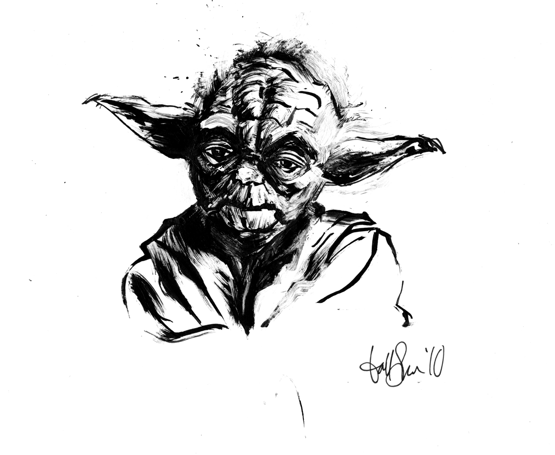
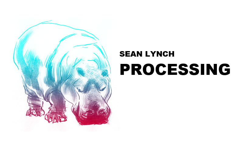
Here are some daily warm up sketches before working on my graphic novel.


My brother and I heard about an opportunity to make a weekly comic strip about video games and we thought we'd submit a comic and see what happens. If you like Super Nintendo games where you fight in streets, then this is for you. We'll see what happens with this strip, but for now it was nice working with my brother, drawing in a completely different manner and making a color strip.


Yeah, life's full of wonderful people and things. Now, I just need to play some more soccer...

Happy Holidays!

Thursday, December 2, 2010

Planet Posters

I received a request to have a copy of the cover of my book, Processing, but I thought it'd be silly just to send a copy of the cover when the real interest of the request was the planets Jupiter on the cover and the idea of "processing." So, I ended up making new posters out of the planet painting series. I like them better this way than when they were in my altered book.  


Wednesday, December 1, 2010

Design Process for VFOG

I've never really shown too much of my process before, so I thought I'd take a chance to show how I design. This particular project is for a client that's been with me almost since day one. The band is a hardcore heavy metal band called, Vessels For Our Ghost

This project had many different parts which had to combine for the whole identity of the band. This includes, a triple fold CD insert front and back, text and logo, myspace page, CD design, CD area behind the CD and behind the jewel case, merchandise and even a design for a drum. It was a big project.

I'm showing the final products first and then showing sketches and ideation periods. Before that though, I'm showing the custom text made for the boys. I tried to use a nasty aesthetic to show what the band feels like and to contrast some of the more precise imagery used in other parts of the project.

Logo for the band:


Logo for the album:


When I first was working on the project, all that we really had to work with were some ideas that the boys had felt were important to the project. After hearing the list of what they were looking for, "political," "dark," "elegant," and "antique," I said, "Why don't we make this look like dirty money?" They liked the idea and I set forth to do a ton of research.

The final product of the front of the CD triple fold insert:


Close to the final product sketch:


One of the layers that I wanted to have in the front of the triple insert. When doing the research on many different kinds of money, I noticed that none really had any kind of military presence. I felt that it was pretty important to this project considering what the boys described to me, and to me, money and war are twin brothers.


They agreed, I went ahead and inked the vehicles. They really liked the world in the back, but compositionally it just didn't work for the front of the triple fold insert, so I said that I'd use it on the back where the lyrics would go. I love drawing and inking machinery so this was a really fun part of the project.


All forms of money in the world have complex areas that try to prevent fraud and, if done well, increase the overall composition and effectiveness of the design. If you look really close at new dollars, they have these little tiny pink and blue hairs throughout the money, I wouldn't be surprised if they're a verifiable security measure. I love texture and so does money, so we put it in there.


Here are some of the earlier stages where I'm just gathering ideas to show the boys and see what they responded too. I'm more concerned with themes and types of imagery at this point.


More ideation showing what some potential layers will look like. They liked the symbol to the right and we made use of that in many pieces of the project.


These were some of the final test sketches for the final layout of the triple fold out insert.


These are a lot of potential layouts influenced by the layouts of actual international money. Once I had done enough of these quick sketches, I felt like I had a handle on the "gesture" of currency and I combined many elements that I liked into the above sketches.


Here's a quick bit of design principles shown to the boys to see what colors that liked, what types of imagery from the money that they liked and to see if it might inspire them to think of more ideas. 


This is the final product of the back of the triple fold insert. There were lyrics here too, but I removed them because I only wanted to show the image. You can see how the triple fold insert front was the starting place of the whole project. I knew that once we had that down, we'd be able to make the rest of the project follow along.


Final product for the CD design:


Sketch for the CD design:


This is the area underneath the CD inside the CD case:


This is the back of the CD case with the track listings:


This project was a doozy. It was open ended so it took a great amount of communication between me and the band. They were really great about telling me what they liked and didn't like, which is absolutely necessary for a project like this and helped me get to a better final project. They've been doing well in the hardcore music scene and I wish them the best of luck in the future!